

How WebP Images Can Speed Up Your Site
A practical guide to WebP image format, file-size savings, Core Web Vitals, e-commerce catalogs, WordPress workflows, conversion methods, and how smaller images translate into faster, happier visitors.
Introduction
On the vast majority of websites, images are the single largest contributor to total page weight. A typical product listing, landing page, or blog article can easily carry 1 MB, 3 MB, or even 10 MB of image data before the browser ever starts painting pixels. For visitors on mobile networks, congested Wi-Fi, or older devices, those megabytes turn directly into seconds of waiting — and seconds of waiting turn directly into bounced visits, lost sales, and lower search visibility.
Choosing an efficient image format is one of the highest-leverage optimizations any site owner can make, because it affects every page that contains images without requiring a redesign, a framework migration, or months of engineering time. Over the last decade, WebP has emerged as the modern default format for web images, and for good reason: it combines the best parts of JPEG and PNG into one format that is now supported by essentially every modern browser in use today.
The short answer to the question in the title is this: WebP can speed up websites because WebP images generally provide smaller file sizes than equivalent JPEG or PNG images while maintaining good visual quality. Smaller files mean less data to download, which can improve page loading performance — especially on mobile and slower connections. But like any tool, WebP delivers the best results when it is actually understood and used inside a broader image optimization pipeline, not just applied as a blanket conversion step.
This guide covers the whole picture: what WebP really is, how it compares with JPEG, PNG, and AVIF, how much file-size reduction you can reasonably expect, what it actually does to Core Web Vitals, how to convert images in practice, which preparation steps you should take before converting, and how to verify that WebP actually moved the needle on your site.
What Is WebP?
WebP is a modern image format developed by Google and first released in 2010. It was created from the ground up as a web-first format whose explicit goal was to replace the older trio of JPEG, PNG, and GIF with a single file type that handled photographs, graphics, and animations well while keeping file sizes small. After more than a decade of iterative improvements and browser adoption, it is today one of the most universally recommended next-gen image formats for public-facing websites.
WebP supports several distinct compression modes, which is why it is flexible enough to sit in between JPEG and PNG in capability:
- Lossy WebP. Uses predictive coding based on VP8 video intra-frame compression, similar in spirit to JPEG but generally more efficient at any given quality level. Well-suited for photographs, product shots, hero banners, and blog imagery.
- Lossless WebP. Preserves every pixel exactly, similar to PNG, but with more efficient dictionary-based compression. Best for sharp UI assets, pixel-perfect graphics, logos, and screenshots where every pixel must match the original.
- Transparency (alpha channel). Supported in both lossy and lossless modes — this is a big advantage over JPEG, which cannot carry transparency at all. For graphics and transparent product cutouts, WebP often beats PNG file sizes by a very wide margin.
- Animation. Animated WebP supports frame-based animation, similar to animated GIF, but usually with much smaller files and 24-bit colour.
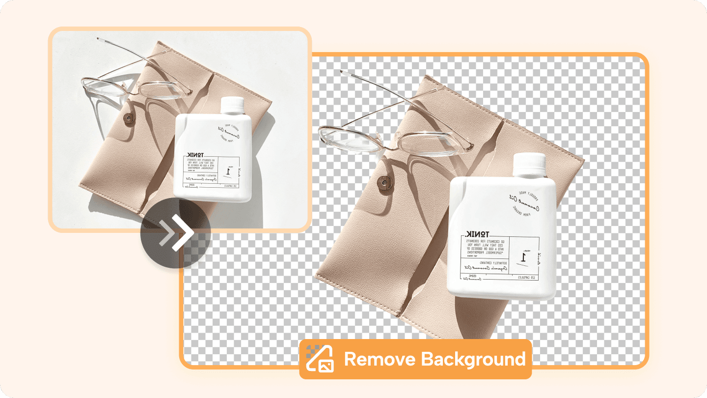
WebP supports transparency (alpha channel) in both lossy and lossless modes, a capability JPEG lacks entirely. This makes WebP a single format for product cutouts, graphics, and photos.
On browser support, as of 2026 WebP is supported in every shipping version of Chrome, Edge, Firefox, Safari, Opera, Brave, and the Android browser. Support on very old operating systems and several-year-old iOS releases is the main reason some teams still keep JPEG or PNG fallbacks in place via the HTML <picture> element — but for the vast majority of traffic, WebP loads natively without issues.
In short: WebP is not new, experimental, or niche. It is a mature, well-supported general-purpose image format whose whole reason for existing is to make web pages lighter.
How WebP Images Can Speed Up Your Site
The mechanics of how an image format affects page load time are surprisingly straightforward. Every image on a page has to be requested over the network, transferred, decoded in memory, laid out by the rendering engine, and finally painted to the user's screen. Anything you can do to shrink the first couple of steps in that chain — network bytes — has an immediate, measurable effect on the user's perceived and actual loading experience.
Here is how choosing WebP can contribute to a faster website:
- Smaller image file sizes. For a given visual quality target, a WebP file is often measurably smaller than a comparable JPEG or PNG. Smaller individual images add up to a lighter overall page weight.
- Less bandwidth consumption. Every byte the browser does not have to pull from the network is a byte that arrives instantly. Hosting bills go down, and users on limited mobile data plans have a better experience.
- Faster downloads. With fewer bytes on the wire, each image finishes downloading in less time, even at the same network speed.
- Reduced page weight. A page that once weighed 4 MB might drop to 2 MB or less by converting its images to WebP. Multiplied across every page on the site, this adds up.
- Faster image rendering. Smaller files decode slightly faster on the CPU side as well, which reduces the time between the browser finishing the download and the pixels appearing.
- Better mobile performance. Mobile networks are both slower and more variable than wired connections, so any reduction in transfer size pays bigger dividends on phones and tablets than it does on a desktop plugged into fibre.
- Improved user experience. Images appearing sooner means less layout shift if dimensions are set correctly, less staring at empty placeholders, and more overall confidence that the page “works fast”.
- Potential SEO and visibility benefits. Page experience signals are a small but confirmed factor in modern search ranking. Image optimisation is one of the cheapest levers for improving those signals.

An illustrative example, not a universal promise: suppose a hero banner that exports to 500 KB as JPEG at the quality setting you find acceptable. Exporting that same image to WebP at a visually indistinguishable quality might come out around 250 KB. That is 250 KB saved on just one image. If the same page has six product shots and three blog thumbnails, the aggregate savings can easily reach into the multiple-megabyte range.
Actual savings depend on the source image, its dimensions, the quality setting you pick, the compression mode (lossy vs lossless), and whether the original image was already optimised in the first place. Some images compress much better than others. Never assume a blanket percentage for every file on the site; always compare the output files side by side.
WebP vs JPEG vs PNG
The reason WebP is such a useful format today is that it occupies a middle ground between the two historically dominant formats. JPEG is excellent for photographs, tiny, and universally supported — but has no transparency and ages badly at aggressive quality levels. PNG is lossless and carries transparency — but is often two to three times larger than a visually equivalent WebP for photographs. WebP combines the best features of both in a single format that modern browsers accept natively.
| Feature | WebP | JPEG | PNG |
|---|---|---|---|
| Compression | Yes | Yes | Yes |
| Transparency | Yes | No | Yes |
| Lossy compression | Yes | Yes | Limited / No |
| Lossless compression | Yes | No | Yes |
| Typical file size | Often smaller | Medium | Often larger |
| Best use cases | Modern websites, photos, graphics, product cutouts | Photos / legacy compatibility | Transparency / graphics / logos |
Read the table with context, not as absolutes. A heavily compressed JPEG at quality 30 may be smaller than a WebP exported at quality 90 — but at that point they are not visually equivalent images. Comparisons only make sense when you are comparing the same output dimensions and the same subjective visual quality. When you control for those two factors, WebP almost always turns in the smallest file.
How Much Can WebP Reduce Image File Size?
There is no universal percentage you can apply to every image on every website. Any article that claims “WebP is always 35 % smaller!” or “50 % smaller!” is rounding a statistical average into a guarantee — and those kinds of claims usually collapse when you test them against a real media library full of photographs, logos, screenshots, product shots, and diagrams.
The real-world result depends on a long list of interacting factors, including but not limited to:
- Original format. PNG graphics compress dramatically better to WebP than a well-optimised JPEG photo does. If the bulk of your library is PNG product cutouts, expect very large savings. If it is already JPEG at quality 80 with metadata stripped, expect more modest gains.
- Image dimensions. Pixel count sets a baseline floor for the output file. A 5000×5000-pixel source image will still be a large WebP. Resizing before compression is usually a bigger lever than format alone.
- Compression quality setting. Quality 20 vs quality 95 produce wildly different sizes for the same visual.
- Image content. Featureless skies and plain backdrops compress extremely well. Fine fabric, foliage, text, noise, and sand compress poorly in every format.
- Photography vs graphics. Photographs respond best to lossy compression; line-art, UI, and diagrams often respond best to lossless.
- Transparency. Replacing a large transparent PNG with a lossy WebP is frequently where the biggest wins happen.
- Whether the original image was already optimised.An unoptimised 8 MB DSLR raw-exported JPEG will collapse to a tiny fraction of its size with almost any sensible export. A previously optimised image has less room to move.
To give a practical example of what this looks like on a real page, suppose a category page carries 24 product thumbnails and a hero banner. Before optimisation, each product image weighs in at an average of roughly 1 MB (a depressingly common number on stores that uploaded raw catalogue photos directly) and the hero is another 2 MB. Total image weight: about 26 MB.
After resizing each image to its actual display dimensions and exporting to WebP at a visually similar quality, you might land at roughly 150 KB per product thumbnail and 400 KB for the hero. The same 25 images now weigh around 4 MB total. That is a 22 MB reduction in page weight per category page. Even on a fast 10 Mbit/s connection, 22 MB of image data represents roughly 18 seconds of pure download time — a gap users notice immediately.
Use that example as an intuition pump, not a promise. The only way to know your actual savings is to measure them on a sample of real files from your own library.
Why Smaller Images Make Websites Faster
The chain from file size to user experience is short and linear. Understanding it helps explain why changing an image format has such reliably visible consequences:
- The browser requests an image URL from the server or CDN.
- The server sends the file across the network as raw bytes. The larger the file, the more bytes must traverse the connection.
- Once download finishes, the browser decompresses and decodes the image data into an in-memory pixel buffer.
- Layout and compositing use those decoded pixels to figure out how to paint the image into the page.
- The final pixels become visible on the screen.
Smaller images shrink steps 2 and 3 directly. Step 2 is the big-ticket item for most real visitors, because network time is typically the longest part of the chain by a wide margin. This is particularly true on:
- Mobile networks. 4G, LTE, and especially 3G speeds vary wildly by geography, signal strength, and tower load. An image that takes 0.4 seconds on Wi-Fi might take 3 seconds on a slow LTE connection.
- Slow or congested connections. Hotel Wi-Fi, conference networks, rural ISPs, and satellite connections all turn small reductions in file size into very large reductions in wait time.
- Large hero images. Above-the-fold hero banners are usually the single largest asset on a landing page. Shrinking just that one image can move the whole page from “slow” to “fast” in one step.
- Product images in e-commerce. A page with 40 product thumbnails pays per-image costs 40 times over.
- Image-heavy blogs and publications. Articles with 10+ inline photos, diagrams, and author headshots benefit enormously from format changes.
- E-commerce catalogues. Category pages, filter pages, search results, and related-products grids all repeat the same per-image cost, multiplied across user scrolling and pagination.
The outcome is not abstract. Research and real-world case studies consistently show that faster page loads correlate with lower bounce rates, longer dwell times, higher add-to-cart rates, and more conversions — especially on mobile, where most e-commerce traffic now originates.
WebP and Core Web Vitals

Google's Core Web Vitals are the three specific metrics that make up the bulk of the “page experience” ranking signal as of 2026. The three signals are:
- LCP (Largest Contentful Paint). Measures when the biggest piece of visible content in the viewport finishes rendering. For the overwhelming majority of pages, that content is a hero image, a product photo, or a banner — in other words, exactly the kind of asset WebP affects.
- CLS (Cumulative Layout Shift). Measures how much visible content “jumps around” as the page loads. Format choice does not fix CLS by itself, but smaller files can download and paint sooner, reducing the window for unsized placeholder shifts to occur — as long as
width/heightattributes or aspect ratio CSS is in place. - INP (Interaction to Next Paint). Measures the responsiveness of a page to user clicks, taps, and keyboard input. WebP's indirect effect on INP is minor, but a lighter page generally means less main-thread contention while the page is still loading its assets.
LCP deserves special attention because it is where image format has the clearest, most direct impact. If your page's largest contentful element is an image, reducing that image's byte size directly reduces LCP time on any connection that is not instant. On a 4G connection, cutting the LCP image from 1.2 MB to 400 KB can move LCP from 3.5 seconds to under 2.5 seconds in a single step.
A few important caveats, though: simply converting an image to WebP does not automatically guarantee better Core Web Vitals. Several other factors matter at least as much:
- Delivering images at the correct pixel dimensions for their display, not a single 6000-pixel master file scaled down with CSS.
- Using responsive image sizes (the
srcsetandsizesattributes) and art direction with<picture>. - Lazy-loading images that are below the fold — but never lazy-loading the LCP image itself.
- Setting
fetchpriority="high"(or equivalent) on the LCP image when possible. - Fast server response times (TTFB) and a well-configured CDN.
- Blocking or deferring non-critical CSS and JavaScript.
- Using modern delivery techniques such as HTTP/2 or HTTP/3, Brotli compression for text assets, and a CDN close to users.
Treat WebP as part of the Core Web Vitals toolkit, not as a magic button you press once to achieve perfect Google rankings. It is the single highest-value piece of the puzzle for many sites, but it still needs to sit inside a coherent page-speed strategy.
How to Convert Images to WebP
There are four practical approaches for converting a site's images to WebP, each suited to different teams and technical comfort levels. Most real teams use a mix.
Option 1 — Online image optimization tools
The simplest option for a non-technical user is an online image optimizer: upload one or more images, choose a target format and quality, review the output, and download the WebP version. This is a one-off or small-batch workflow, ideal for marketing teams, bloggers, and anyone processing up to a few dozen images per week.
A sensible pre-processing step in any online pipeline is to prepare the image itself before you reach for format conversion. Removing distracting backgrounds, cropping in tight, and resizing to the actual display dimensions usually saves more bytes than format alone, and the processed file compresses better into WebP after. RMBG.PRO is often used as that first-stage preparation tool for product and marketing images — a quick background removal pass, optional white or brand-colour backdrop, and a clean download that is already the right size and shape for the page layout. You can, for example, prepare a product photo with RMBG.PRO's background removal tool and then feed the resulting PNG/JPG into your preferred WebP converter. For images that are already in WebP form and need editing, RMBG.PRO also offers a dedicated Remove Background from WebP flow so you do not have to re-encode twice.
Option 2 — WordPress
WordPress sites can lean on image-optimization plugins and modern image workflows in a number of ways: many popular optimisation plugins generate WebP derivatives automatically on upload and serve the smallest applicable format to supported browsers. For teams working inside WordPress, complementary editorial workflows — such as preparing product photos with background removal before media-library upload — combine well. RMBG.PRO maintains a WordPress plugin for bulk background removal, and you can read more about a full WordPress image optimisation pipeline in the guide on WordPress image optimization.
Option 3 — Command line / developer tools
Developers comfortable with a terminal can use Google's official cwebp encoder directly, or general-purpose image-processing tools such as ImageMagick with its WebP delegate compiled in. Both support quality presets, metadata stripping, resizing, alpha handling, and batch processing, and both are scriptable into a CI pipeline or cron job. This is the most common choice for converting an existing media library of tens of thousands of files in one shot.
Option 4 — Build-time image optimization
Modern frameworks and static-site generators (Next.js, Nuxt, Astro, Gatsby, Hugo, etc.) typically ship with first-party image components and build-time pipelines that automatically generate WebP (and often AVIF) variants, produce responsive srcset entries, and set sensible loading priorities without manual work. If you are on a framework that offers these features, turning them on is almost always the simplest long-term way to get WebP delivered consistently across the entire site without a separate conversion step.
How to Optimize Images Before Converting Them to WebP
Converting a giant, badly prepared image directly to WebP is a little bit like replacing a dirty oil filter on a car that is still riding on four flat tires: yes, you did one good thing, but the overall result is still disappointing. Format works best on top of a solid preparation pipeline. Do the following steps in roughly this order before you worry about which format button to click.
- Remove unnecessary background areas. Product photos shot in a studio with a big white or grey backdrop carry hundreds of thousands of pixels of nothing but the same colour. An AI background remover such as RMBG.PRO strips that out in a few seconds, either leaving a transparent cutout ready for a WebP alpha export or flattening to a white marketplace background before export. A tighter crop usually yields a smaller file as well as a more visually useful image. See the step-by-step guide on how to remove the background from an image for a full walkthrough.
- Resize the image to the required display dimensions.If the hero slot on your home page is 1600 pixels wide, do not upload a 6000-pixel-wide file and scale it down with CSS. Size the image to its actual rendered pixel width (plus a 1.5× or 2× factor for retina displays) and export from there.
- Choose an appropriate compression quality. Do not default to quality 100 “just to be safe”. Export at quality 80, 70, and 60, then compare at actual size. Most photographic content is visually identical at quality 70–85 compared to the raw source. Use the lowest quality that still looks correct to you — that is where the savings live.
- Strip unnecessary metadata when appropriate.EXIF camera data, geolocation tags, embedded colour profiles for sRGB images that do not need them, and thumbnail duplicates add size for no user benefit. Most encoders strip metadata by default in 2026, but verify the output for sensitive photos.
- Use WebP when suitable. For photographic and general web content, WebP lossy is almost always the right call. For pixel-perfect graphics and transparent assets where every edge must be exact, test lossless WebP against PNG and keep whichever is smaller (it is usually WebP).
- Use responsive image sizes. Generate multiple pixel widths (360 px, 720 px, 1280 px, 1920 px, etc.) and expose them through
srcsetwithsizesdescribing the layout width. Phones should not download a 1920-pixel hero for a 390-pixel-wide viewport. - Avoid uploading oversized source files. The fastest image is the one you never upload in the first place. Crop aggressively before upload, not after.
- Use lazy loading for below-the-fold images.Almost every modern image component or plugin does this by default now, but double-check that the LCP image above the fold is explicitly excluded from lazy loading.
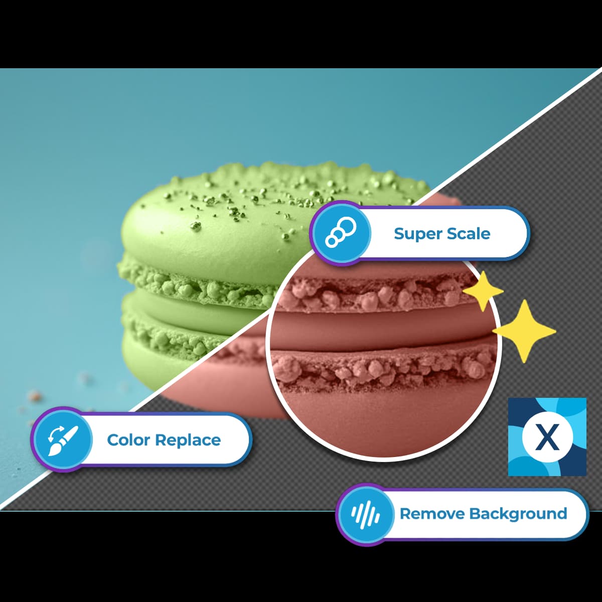
Preparing an image for the web: remove unwanted backgrounds, crop to actual display dimensions, choose a sensible quality, and only then export to WebP or another efficient format.
RMBG.PRO features such as background removal and background replacement fit naturally into step 1 of this pipeline. A product photo exported from RMBG.PRO is already the right aspect ratio for catalogue listings and marketing creatives, with a distraction-free backdrop ready for a tight WebP export. For a full overview of the RMBG.PRO product suite and how it slots into production workflows, see the dedicated guide on RMBG.PRO as a leading background remover.
Prepare Optimised Images Before WebP Conversion
Remove backgrounds, crop tightly, and export clean product and marketing images with RMBG.PRO before running your WebP export pipeline — smaller pixels mean even smaller WebP files.
Free • No signup • AI-powered • Transparent PNG / WebP • Bulk capable
WebP for E-Commerce Websites
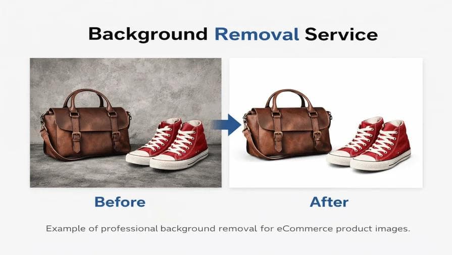
If there is one category of website where WebP consistently pays for itself within a week, it is e-commerce. An online store is a high-volume, image-heavy environment almost by definition. Hundreds or thousands of product images, category headers, sale banners, related-products carousels, homepage sliders, and marketing creatives add up very quickly to a staggering amount of transferred data.
WebP is particularly useful on these common e-commerce surfaces:
- Product images. Catalogue photos, often in bulk, are the largest image pool in any store and therefore the largest single source of savings.
- Category pages. A grid of 36 product thumbnails, each 40 KB lighter in WebP, saves 1.4 MB per page load.
- Product galleries. 5–15 additional images per product detail page, frequently the primary LCP candidate on the page.
- Homepage banners and hero creatives. Usually the single biggest asset. A 60 % reduction in one hero image is a massive win.
- Seasonal / marketing images. Black Friday, sales, campaign landing pages — all image-heavy and often deployed in a rush without proper optimisation.
This is also why image preparation matters so much in e-commerce. A 5-megapixel product photo with a whole studio backdrop still in frame compresses poorly even to WebP. The same product with the background removed by AI, re-cropped tight to the subject, and sized to the actual listing dimensions will be dramatically smaller — and that smaller source compresses even more efficiently to WebP. For more details on this pipeline, see the best AI background remover for e-commerce and the platform-specific guides for Shopify product images and WooCommerce product images. For stores processing entire catalogues at once, the article on bulk product image editing for e-commerce walks through the end-to-end workflow.
A final reminder for e-commerce teams: even with WebP enabled, image dimensions and responsive delivery still matter. A 2000×2000-pixel WebP will still be slower than a properly sized 600×600 WebP in a product-card slot. Format works with sizing, not in place of it.
WebP for WordPress
WordPress sites, in aggregate, carry the biggest media libraries on the internet. A typical small business WordPress site might hold several thousand media attachments; a large publisher or a mature WooCommerce shop can easily have hundreds of thousands. Every one of those images is a candidate for WebP.
Typical WordPress WebP patterns in 2026 include:
- Automatic WebP generation on upload. Most popular image-optimization plugins produce a WebP variant alongside every JPG/PNG they process, then serve the smallest applicable variant to supported browsers.
- Serving modern formats via CDN rewrite rules.Many WordPress-optimised hosts and CDNs transparently serve WebP (and sometimes AVIF) without any plugin work.
- Generating the correct image dimensions.WordPress core generates multiple image sizes on upload; make sure your theme registers sizes that match the actual rendered widths in posts, pages, WooCommerce loops, and headers.
- Lazy loading configured correctly. WordPress core adds
loading="lazy"by default to most images since 5.5; verify that above-the-fold hero images either have it removed or the LCP slot is sized to avoid a penalty. - Avoiding duplicate or oversized media. Editorial teams frequently upload 10 MB DSLR originals straight into the media library and embed them into posts with no pre-processing. A small editorial prep workflow — background removal, crop, resize — before upload saves bytes on every subsequent derivative.
The RMBG.PRO WordPress bulk background-removal plugin slots naturally into this world: you use it to tidy up WooCommerce product photos, editorial imagery, and custom-fields media in bulk, and your existing image-optimisation plugin takes the cleaned files and turns them into WebP on upload. For a deeper dive into the complete WordPress picture, see the published article on WordPress image optimization.
And, if you are optimising branded images with logos, badges, or copyright marks, the article on how to watermark product images walks through applying consistent brand protection before the final WebP export.
WebP vs AVIF
AVIF is a newer image format based on the AV1 video codec, and the question of WebP vs AVIF comes up naturally in any conversation about next-gen formats. The honest 2026 answer is that AVIF offers impressive compression improvements on certain kinds of imagery, particularly at very low bitrates, while WebP remains an extremely solid and widely supported default with a much simpler encoding profile and lower computational cost.
| Dimension | WebP | AVIF |
|---|---|---|
| Compression efficiency | Very good across the board | Often better on photographs at aggressive bitrates |
| Browser support | Near-universal in 2026 | Very strong in modern browsers; slightly more gaps on older enterprise devices |
| Encoding complexity / time | Fast, low CPU cost | Slower, much more CPU intensive; encoding time can be a factor for large libraries |
| Image quality & artifacts | Cleanly documented, easy to predict | Excellent at low bitrates; can struggle with certain classes of fine detail |
| Practical adoption | De facto default for modern web | Growing fast, often delivered alongside WebP via <picture> fallbacks |
| When to choose | Default for simplicity, speed, reliability, widest practical compatibility | When you have a pipeline that can generate both WebP and AVIF variants and serve them selectively |
Neither format is a blanket winner in 2026. WebP remains a sensible default on its own — converting to WebP alone gets you 80 %+ of the possible value for 20 % of the operational complexity. The teams that get the absolute best results are usually generating both WebP and AVIF variants in their build pipeline and letting the browser pick the best one, which is exactly what first-party image components in modern frameworks already do automatically.
Common Mistakes When Using WebP
Converting to WebP correctly gives big wins, but converting poorly can leave you with larger files than you started with, broken pages on old browsers, or images that look worse than the originals. Here are the most common mistakes, roughly in order of how often teams actually make them.
- Converting images without resizing them first.Format choice rarely beats correctly chosen pixel dimensions for total bytes saved. The biggest image optimisation mistake is still uploading a 6000-pixel-wide file into a 800-pixel-wide slot.
- Using extremely aggressive compression. Cranking quality down to 20 just to hit a number produces muddy, blocky photos, crushed edges on logos, and banding on gradients. If the image looks noticeably worse, you went too far.
- Serving oversized images. Same issue as point one, phrased differently. Always generate the image at the sizes it is actually rendered at.
- Forgetting responsive images. Mobile viewports do not need desktop-width files. Use
srcset,sizes, and<picture>. - Lazy-loading the LCP image. This is a classic self-inflicted wound. Mark the LCP image with
fetchpriority="high"or the equivalent, and ensure it is not lazy loaded. - Ignoring image dimensions in CSS/HTML. Omitting
width/heightattributes (or CSS aspect-ratio declarations) causes layout shifts when the images finally paint, even when the files themselves are tiny. - Converting every image without testing. Some files compress better as optimised PNG or JPEG. Always compare a sample of real files.
- Removing JPEG/PNG fallbacks when compatibility requirements still exist. If your analytics still show a meaningful slice of very old browsers, keep JPG/PNG fallbacks behind a
<picture>element. - Assuming WebP alone makes a website fast.Format is one piece. TTFB, JavaScript, render-blocking CSS, fonts, third-party scripts, and CDN configuration all matter. Do not run a WebP conversion and declare the performance project finished.
How to Check Whether WebP Actually Improved Your Website Speed
Guessing does not count. Any optimisation change — format or otherwise — should be followed by a measurement pass to confirm that something actually improved. Four standard lab and field tools cover nearly every use case:
- Google PageSpeed Insights. Combines lab data (Lighthouse) with field data (Chrome User Experience Report) and flags oversized images, missing modern formats, missing width/height, and more. The first place to check any change.
- Lighthouse. Built into Chrome DevTools. Run Lighthouse audits locally on the affected pages before and after the conversion. Compare the two reports side by side, paying close attention to image bytes, LCP, and the “Serve images in next-gen formats” audit.
- Chrome DevTools Network panel. Open DevTools, reload the page with “Disable cache” on and “Slow 4G” throttling enabled. Compare the “Img” row in the footer summary, inspect individual image transfer sizes, and compare Waterfall charts before and after.
- WebPageTest. Excellent for multi-step tests across real devices, real locations, and real connection speeds. Also produces very detailed filmstrip and byte breakdowns.
When running before/after comparisons, specifically compare:
- Page size and especially image transfer size — the most direct number.
- LCP, both the timing and which element is flagged as the LCP candidate.
- Number of requests — unchanged after a pure format conversion, but it is a sanity check if you also restructure responsive sizes.
- Overall load time on slow connections, especially mobile.
- Mobile performance specifically — because mobile is where most image bytes actually hurt.
Do not fabricate or trust single-sample results. Run the test a few times with cache disabled or on a freshly built preview URL. A proper before/after comparison is the only way to tell whether WebP moved the needle, and by how much, on your actual pages.
How RMBG.PRO Can Help Optimize Your Images

RMBG.PRO is first and foremost an AI image-processing platform built around background removal, editing, and bulk product-image preparation. It is not primarily a WebP encoder itself — but it fits directly into the image optimisation pipeline as the critical step before format conversion, which is where the majority of byte savings actually come from.
The RMBG.PRO capabilities that map cleanly onto a WebP workflow are exactly the ones described earlier in the preparation chapter:
- AI background removal. Isolate the subject from a distracting backdrop in a single click. Eliminating those extra pixels yields a smaller file and a more useful image, and the cleaned result compresses more efficiently into WebP on the next step.
- Image processing and editing. Crop, resize, adjust, and clean up product shots inside the same tool so the file you export is already the right dimensions for the page slot it will fill.
- Custom backgrounds. Apply a white, black, or brand-coloured background when a marketplace image spec or banner creative calls for a solid backdrop instead of transparency. Keep the transparent master for other uses.
- Bulk image processing. WordPress plugin for WooCommerce catalogues and developer-accessible API endpoints for team pipelines that need to process a whole catalogue at once, not one product photo at a time.
- E-commerce image preparation. Designed explicitly around the product-photo and marketing-creative workflows that produce the bulk of most sites' heavy image assets.
- Editing before publishing. Use the same tool for cleaning up hair, fabric, edges, and reflective parts of product photos so your final compressed WebP actually looks good, not just small.
The practical connection is simple: removing unnecessary backgrounds and preparing images correctly complements WebP optimisation. A WebP file exported from a tightly cropped, clean product cutout will always be smaller and look sharper than a WebP file exported from the original cluttered studio shot. Good preparation makes WebP do its job better.
If the bulk or API side of this is relevant to your team, see the bulk product image editing for e-commerce guide and the background removal API developer integration notes. Otherwise, open RMBG.PRO directly in the browser and start with one image to feel the workflow before committing to a pipeline.
Frequently Asked Questions
Does WebP make websites faster?
Yes, often. WebP images are frequently smaller than visually equivalent JPEG or PNG files, which reduces the amount of data the browser has to download. On real-world pages, that usually translates to shorter load times, especially on mobile. Exact speedups depend on the source images, connection speed, and the rest of the page.
Is WebP better than JPEG?
For most web use cases today, yes — at the same visual quality, WebP often produces a smaller file than JPEG and supports transparency, which JPEG cannot do at all. JPEG remains the right choice only when absolute legacy compatibility is the overriding priority.
Is WebP better than PNG?
Often, especially for photographs or alpha-heavy graphics where you are willing to accept lossy compression. For strictly lossless UI assets, test both lossless WebP and PNG and keep the smaller one. Lossless WebP tends to win for most real web assets, but PNG is still perfectly valid and universally supported.
Does WebP improve Google PageSpeed?
It can, because PageSpeed and Lighthouse explicitly audit for “Serve images in next-gen formats” and penalise oversized images. Converting to WebP directly addresses those audits, but page speed depends on many other things (TTFB, JS, CSS, responsive sizing, priority) as well.
Does WebP improve SEO?
Indirectly, yes — page experience signals, of which Core Web Vitals are a large piece, are a small but confirmed factor in modern search ranking, and image optimisation is a cheap way to improve those signals. WebP is not a ranking hack by itself, but it is part of a well-optimised page that ranks better.
Should every website use WebP?
Nearly every modern website can benefit from at least evaluating WebP. The main exceptions are sites whose analytics still show a very large share of decade-old browsers, and sites with image pipelines that literally cannot be changed. For most sites, the tradeoffs are overwhelmingly positive.
Does WebP reduce image quality?
Lossy WebP can reduce quality if you choose an extremely aggressive quality setting, exactly the same as JPEG. At normal quality levels (roughly 70–90) the difference is usually invisible. Lossless WebP preserves every pixel with no quality loss at all.
Can I convert JPG to WebP?
Yes. JPG is one of the most common inputs for WebP conversion, and nearly every online converter, desktop app, command-line encoder, and build pipeline supports JPG → WebP directly.
Is WebP supported by modern browsers?
Yes. As of 2026, WebP is supported in every current version of Chrome, Edge, Safari, Firefox, Opera, and the Android browser. Coverage is extremely broad; only very old operating systems and long-outdated enterprise devices still lack it.
Should I use WebP or AVIF?
WebP is the simpler, faster, most broadly compatible default in 2026. AVIF often produces even smaller files on photographic content, especially at aggressive bitrates, but encodes much slower and requires slightly more operational care. The ideal pipeline generates both as variants and serves the smallest supported one via <picture>.
Conclusion
WebP is not a silver bullet. It will not fix a website drowning in unoptimised JavaScript, a slow origin server, or a CSS bundle that blocks rendering for three seconds. But it is one of the simplest, most reliable, most broadly applicable tools available for reducing page weight. It works because it reduces image file sizes, and reducing image file sizes directly reduces the amount of data a browser has to download, which — on any connection slower than instant — produces a faster page.
The biggest mistake people make with WebP is treating it as a one-click panacea. The best results come from a complete image optimization strategy: remove unnecessary background areas, resize images to their actual display dimensions, choose a sensible quality, generate responsive srcset and sizes attributes, lazy load below the fold but not the LCP image, set dimensions correctly, cache aggressively on a CDN — and then choose an efficient modern format as the final layer. WebP is that final layer for most of the web today.
If you have ever wondered why an image optimisation article keeps coming back to background removal, it is because the single easiest way to make an image file smaller is to stop encoding thousands of pixels of irrelevant backdrop. That is where RMBG.PRO fits into the story: as the preparation step before export and WebP conversion. A tight, clean, well-cropped product photo becomes a smaller WebP and a faster page than the cluttered studio shot you started with.
Start small. Take your site's heaviest page, convert its top five images to WebP at a sensible quality, measure the before and after with Lighthouse, and see for yourself. On most pages, that one afternoon of work will produce a measurable win. Then roll the pattern out to the rest of the site.
Prepare Smaller, Faster-Loading WebP Images
Clean up backgrounds, crop tightly, and export optimised images with RMBG.PRO before compressing to WebP — give your visitors faster pages and smaller downloads in one workflow.
Free • No signup • AI-powered • Product ready • WebP export compatible • Bulk / API capable